

Is your website bleeding visitors faster than a sieve holds water? You’re not alone, mate. With mobile devices accounting for over 60% of web traffic in Australia, businesses that haven’t embraced Mobile-Friendly Web Design are watching potential customers slip through their fingers every single day. At Web Mobile Solutions, we’ve witnessed firsthand how poor mobile experiences can devastate conversion rates and tank search rankings faster than you can say “bounce rate.”
The harsh reality is that modern Aussie consumers expect lightning-fast, seamless mobile experiences. When your Web Design fails to deliver on mobile devices, you’re not just losing visitors – you’re handing your competitors a golden opportunity to steal your market share. After delivering 300+ web design projects across Sydney since 2014, we’ve cracked the code on what makes mobile visitors stick around and convert.
Why Mobile Users Are Abandoning Your Website
The Mobile Experience Crisis
Mobile users are notoriously impatient, and rightfully so. Research shows that 53% of mobile users will abandon a website if it takes longer than three seconds to load. But speed isn’t the only culprit causing visitor exodus. Poor navigation, tiny buttons that require a magnifying glass to tap, and content that’s impossible to read without zooming are all contributing to your mobile abandonment rates.
Best Web Design principles for mobile aren’t just about making things smaller – they’re about reimagining the entire user experience for touch-based interactions. When visitors arrive on your site via their smartphones, they’re often looking for quick answers or immediate solutions. If your mobile site doesn’t deliver information efficiently, they’ll hit the back button faster than a cricket ball off Steve Smith’s bat.
Common Mobile Design Mistakes Killing Your Conversions
Many Sydney businesses fall into the same traps when it comes to mobile design. Cramped layouts that work fine on desktop become nightmarish obstacle courses on mobile devices. Text that’s perfectly readable on a 24-inch monitor becomes microscopic on a 6-inch phone screen. Navigation menus designed for mouse cursors become impossible to use with fingertips.
Expert Web Design recognises that mobile isn’t just a smaller version of your desktop site – it’s an entirely different medium with unique constraints and opportunities. Pop-ups that are mildly annoying on desktop become completely unusable on mobile. Forms that are straightforward on desktop become marathon endurance tests on smartphones.
Strategic Mobile-First Web Design
The Mobile-First Design Philosophy
At Web Mobile Solutions, we’ve adopted a mobile-first approach to Web Design that starts with the smallest screen and scales up. This isn’t just a trendy buzzword – it’s a fundamental shift in how we conceptualise and build websites. By designing for mobile constraints first, we create experiences that are inherently focused, fast, and user-friendly across all devices.
Our affordable Web Design process begins with understanding your mobile users’ journey. We map out their needs, pain points, and desired actions, then craft interfaces that guide them seamlessly towards conversion. This approach has helped our clients achieve significant improvements in mobile engagement and conversion rates.
Technical Excellence Meets User Experience
Pro-Level Web Design requires more than just making elements fit on smaller screens. Our team combines cutting-edge responsive design techniques with performance optimisation strategies that ensure your site loads quickly and functions flawlessly across all mobile devices. We utilise advanced CSS Grid and Flexbox layouts, optimised image delivery systems, and progressive web app technologies to create mobile experiences that rival native apps.
Our technical expertise extends to implementing touch-friendly interfaces, optimising for various screen densities, and ensuring compatibility across different mobile browsers and operating systems. Every Web Design specialist on our team understands the nuances of mobile development and stays current with the latest mobile design trends and technologies.
Benefits of Professional Mobile-Friendly Web Design
Immediate Performance Improvements
When you invest in professional Mobile-Friendly Web Design, the benefits start flowing immediately. Your bounce rates will plummet as visitors find it easier to navigate and consume your content. Mobile conversion rates typically see improvements of 20-40% when sites are properly optimised for mobile devices.
Google’s mobile-first indexing means that your mobile site performance directly impacts your search rankings. Websites with excellent mobile experiences consistently outrank their poorly optimised competitors in search results. This translates to increased organic traffic and higher visibility for your Sydney business.
Long-Term Business Growth
Beyond immediate performance gains, mobile-optimised websites position your business for sustained growth. As mobile usage continues to increase, having a robust mobile presence becomes increasingly critical for capturing and retaining customers. Your investment in mobile design pays dividends through improved customer satisfaction, increased repeat visits, and positive word-of-mouth recommendations.
Mobile-friendly sites also support your broader digital marketing efforts. Social media campaigns, email marketing, and paid advertising all perform better when they direct traffic to mobile-optimised landing pages. Your marketing ROI improves when visitors can easily complete desired actions regardless of their device.
Mobile Design Performance Comparison
| Metric | Standard Website | Mobile-Optimised Website | Improvement |
| Average Load Time | 8.2 seconds | 2.8 seconds | 66% faster |
| Search Ranking (Mobile) | Page 3–4 | Page 1–2 | Stronger SEO visibility |
| Pages Per Session | 1.8 | 4.2 | 133% increase |
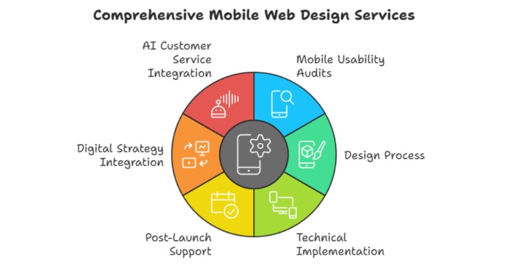
Our Comprehensive Mobile Web Design Services
Complete Mobile Optimisation Package
Web Mobile Solutions provides comprehensive end-to-end mobile web design services that enhance your online presence. Our comprehensive approach begins with thorough mobile usability audits that identify every barrier preventing mobile users from engaging with your content. We analyse user behaviour data, conduct mobile performance testing, and benchmark your site against mobile best practices.
Our design process utilizes industry-leading tools like Figma and Adobe XD to create pixel-perfect mobile interfaces that align with your brand identity, while prioritizing user experience. We craft responsive layouts that adapt fluidly across different screen sizes, ensuring consistent functionality from the smallest smartphone to the largest tablet.
Technical Implementation and Support
Beyond design, our technical team implements robust mobile solutions that deliver exceptional performance. We optimise images for mobile delivery, implement efficient caching strategies, and utilise content delivery networks to ensure fast loading times regardless of user location. Our hosting infrastructure includes SSD storage, SSL certificates, malware protection, and DDoS defense systems with a 99.9% uptime guarantee.
Post-launch support includes ongoing mobile performance monitoring, regular updates to maintain compatibility with new devices and browsers, and continuous optimisation based on user behaviour analytics. Our 20+ ongoing maintenance contracts demonstrate our commitment to long-term client success and mobile performance excellence.
Integration with Broader Digital Strategy
Our mobile web design services integrate seamlessly with your complete digital marketing strategy. We ensure that your mobile site supports your SEO objectives, social media campaigns, and email marketing efforts. Our team can also develop complementary mobile applications and cloud-based services that extend your mobile presence beyond your website.
Partnership with Reptri, Australia’s first AI receptionist service, allows us to integrate advanced customer service capabilities directly into your mobile site. This creates comprehensive mobile experiences that handle customer inquiries, book appointments, and guide users through complex purchasing decisions.
Why Choose Web Mobile Solutions for Your Mobile Web Design
Proven Track Record and Experience
Since 2014, we’ve been Sydney’s trusted partner for businesses seeking exceptional mobile web design solutions. Our portfolio includes over 300 successfully completed projects spanning small local businesses to large enterprise clients across diverse industries. Recent projects like OZ MOOD gift platform, Masterful Painter, and DAEI Fast Food demonstrate our versatility and commitment to delivering mobile experiences that drive business results.
Our team combines 15+ years of collective industry experience with cutting-edge knowledge of current mobile design trends and technologies. We stay ahead of the curve by continuously learning and adapting to the evolving mobile landscape, ensuring our clients always receive contemporary, effective solutions.
Transparent Pricing and Exceptional Value
At Web & Mobile Solutions, we believe in honest, transparent pricing that reflects our core values of integrity and fairness. Every project is tailored to your unique business needs, ensuring you receive exceptional value without hidden costs.
Our pricing approach is designed to support businesses of all sizes, whether you need web design, mobile app development, SEO, or cloud-based solutions. By combining creativity with functionality, we deliver results that not only fit your budget but also drive long-term growth.
With over a decade of experience, we’re committed to building lasting client partnerships based on trust, collaboration, and measurable results.
Client-Centric Approach and Values
Our core values of integrity, honesty, and long-term relationship building guide every client interaction. We invest in understanding your unique business needs, target audience, and competitive landscape to create mobile solutions that align perfectly with your objectives. Our communication throughout the development process ensures transparency and keeps you informed at every stage.
Client testimonials consistently highlight our attention to detail, timely delivery, and exceptional communication skills. Jackson noted our “exceptional software development” and “attention to detail,” while Amanda Clark praised our ability to turn concepts into reality within budget and timeline constraints.
Frequently Asked Questions
How long does mobile website optimization take?
Typical mobile optimisation projects take 2-4 weeks depending on site complexity and requirements. We provide detailed timelines during initial consultations and maintain clear communication throughout the process.
Will mobile optimisation affect my current desktop website?
Our responsive design approach enhances both mobile and desktop experiences simultaneously. Desktop functionality improves while mobile usability dramatically increases.
Do you provide ongoing mobile performance monitoring?
Yes, our maintenance packages include continuous mobile performance monitoring, regular updates, and optimisation improvements based on user behaviour analytics.
Can you integrate mobile design with existing marketing campaigns?
Absolutely. We ensure mobile designs support and enhance your existing marketing efforts, including social media campaigns, email marketing, and paid advertising initiatives.
What happens if I’m not satisfied with the mobile design results?
We offer a 30-day money-back guarantee on all services. Additionally, we work closely with clients throughout the process to ensure complete satisfaction with the final mobile experience.
Ready to stop losing mobile visitors and start converting them into loyal customers?
Contact Web Mobile Solutions today to discuss your mobile web design needs. Let’s transform your mobile presence and drive real business results together.
📞 Phone: +61 422 760 153
🤖 AI Receptionist: 0489 26 00 26
📧 Email: info@webmobilesolutions.com.au
📍 Address: 53 Nancarrow Ave, Ryde, NSW, 2112